In UX design, low-fidelity artifacts can be valuable for fast, cheap idea development, focused critique, and better user/non-designer involvement. High-fidelity designs are important for final products, but low-fidelity sketches and prototypes offer essential reality checks for design success.
As a graphic designer, I used a sketchbook to take notes, make small sketches and conduct calculations. These annotated diagrams were always intended to organize myself, not to be artful layouts or page spreads. I never included those sketches in my portfolio because my book was always focused on final, production-ready products.
Making it pretty (fast).
After shifting from graphic design towards design strategy in grad school, I now find myself in the SF UX/tech industry dealing with similar challenges again. I’m shocked by the intense focus on making high-fidelity, pixel-perfect designs as early in the process as possible, often facilitated by UX prototyping tools, like InVision below.

While learning the user-centered design process, I came into the habit of whiteboard sketching, using post-its for more than notes, making paper models and acting out scenarios. I learned from my colleagues and adapted designs collaboratively, on-the-fly. We created artifacts that sometimes had little to do with the final designs, but kept our design process moving forward.
There's no definitive data to prove low-fidelity works better, but there are a lot of reasons to put it to use.
Fidelity what?
Since UX is famous for confusing terminology, let’s define fidelity here. Fidelity is the volume and granularity of detail in design elements. So, low-fidelity designs are “rough cuts” of design ideas that contain little of the actual content, using placeholders and blocks to indicate content areas instead. On the other end of the spectrum, high-fidelity designs include actual content, a clear typographical hierarchy, images and icons in the correct position and, sometimes (though I see it more and more), visual design elements such as colors, typefaces and artwork.
Thanks to the new high-fidelity world where everything seems to be rendered in visual design, we have a tendency to describe our artifacts with phrases like sketches and prototypes, using them interchangeably. But in a classic sense, sketches and prototypes are different beasts and are used differently in phases of a project.

The crux determining the fidelity of a design artifact is it’s purpose — not if it’s done on paper or on the computer. The volume of detail depends on what you need to learn. With a few bits of paper and markers, a small group could simulate the user experience of a genetics-based dating app (which one group of EchoUsers did at our bi-yearly offsite, seen below). With some roleplay and hand-drawn artifacts, it’s possible to determine if the idea would resonate with users, if the process too long, what the service journey looks like, what channels work best, how many elements would need to be developed, and even how you’ll make money.

Why it's worth making ugly things
“Fancy” prototyping tools afford us the ability to design in high-fidelity quickly and early on in the project, but there is some value to making low-fidelity ugly artifacts.

You can make new screens fast and cheap!
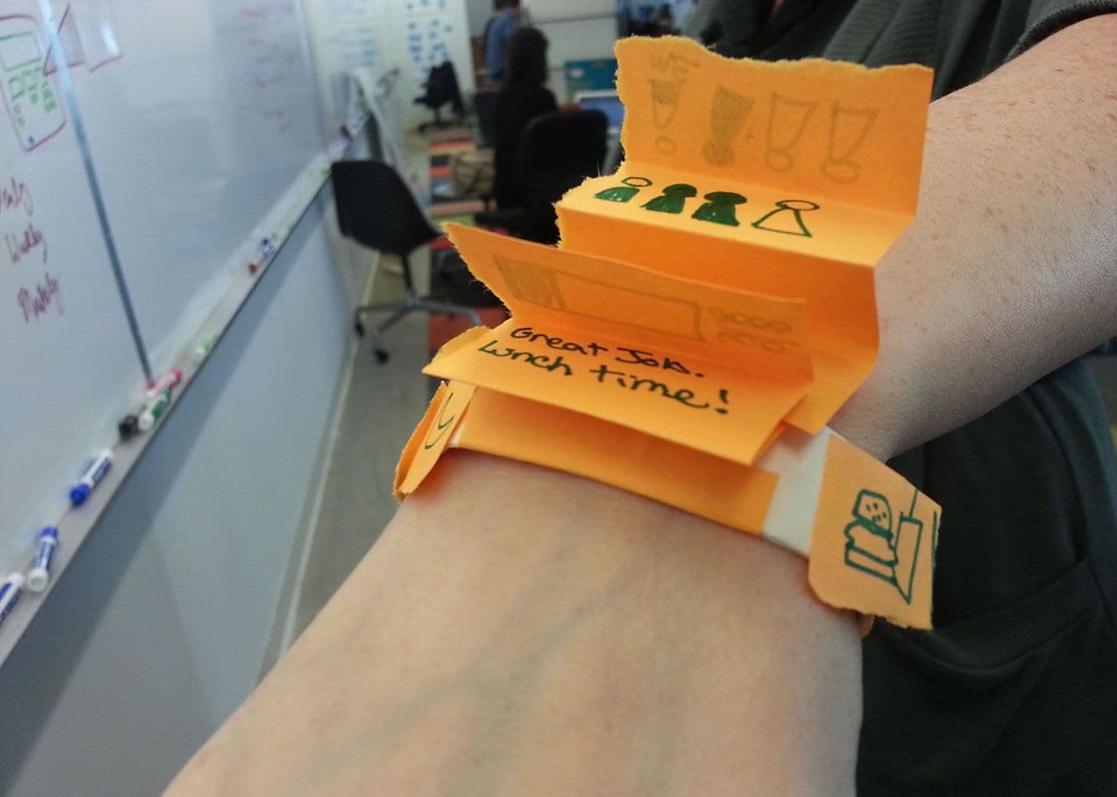
Stacks of post-its stuck on a smart band (like the photo above) can be tested in real time, in the real world. And, if you need a new screen or the user wants to see it done differently, it’s just takes a couple minutes and a pen to make one. If you had to do that same work in InVision or Sketch, it will take more time and effort to get that feedback.

You can share sooner and focus critique on what you need to know now.
Low-fidelity designs really shine when you share what you’re working on. Without socializing the ideas, you could end up making a lot of assumptions in your high-fidelity Sketch designs. You would spend precious design time debating between the inclusion of the Facebook social graph or asking for email addresses before you’ve gotten critical feedback, which might reveal a user’s friends don’t actually give a crap.
In recent projects, I’ve noticed that early concepts rendered in a “shiny” glory look like final ideas. I personally struggle to provide good critique because it’s much easier to focus on easy stuff (like “fix this type weight”) than to tell a colleague, “I’m not sure I believe your concept.”
You can more easily involve your users and non-design teammates.
By starting in low-fidelity, the design process is more accessible. Involving non-design teammates and users in early design reviews allows you to learn how the product fits into their lives.
Users looking at high-fidelity concepts will be more likely to judge it like any other product on the market: do I love it or hate it? Users won’t necessarily see it as something they can mold into what they need or want– even if the design could be changed.
Designers will always finish projects in high-fidelity to bring an idea to life. But, I think we’re mistreating a critical part of the design journey by hiding low-fidelity work like a dirty, little secret. If you haven’t tried these types of low-fidelity sketches and prototypes, you could be missing important reality checks needed for your idea to succeed. And, if you keep low-fidelity work only to yourself, your clients will continue to misunderstand your process and your users won’t be given the space to help you.
