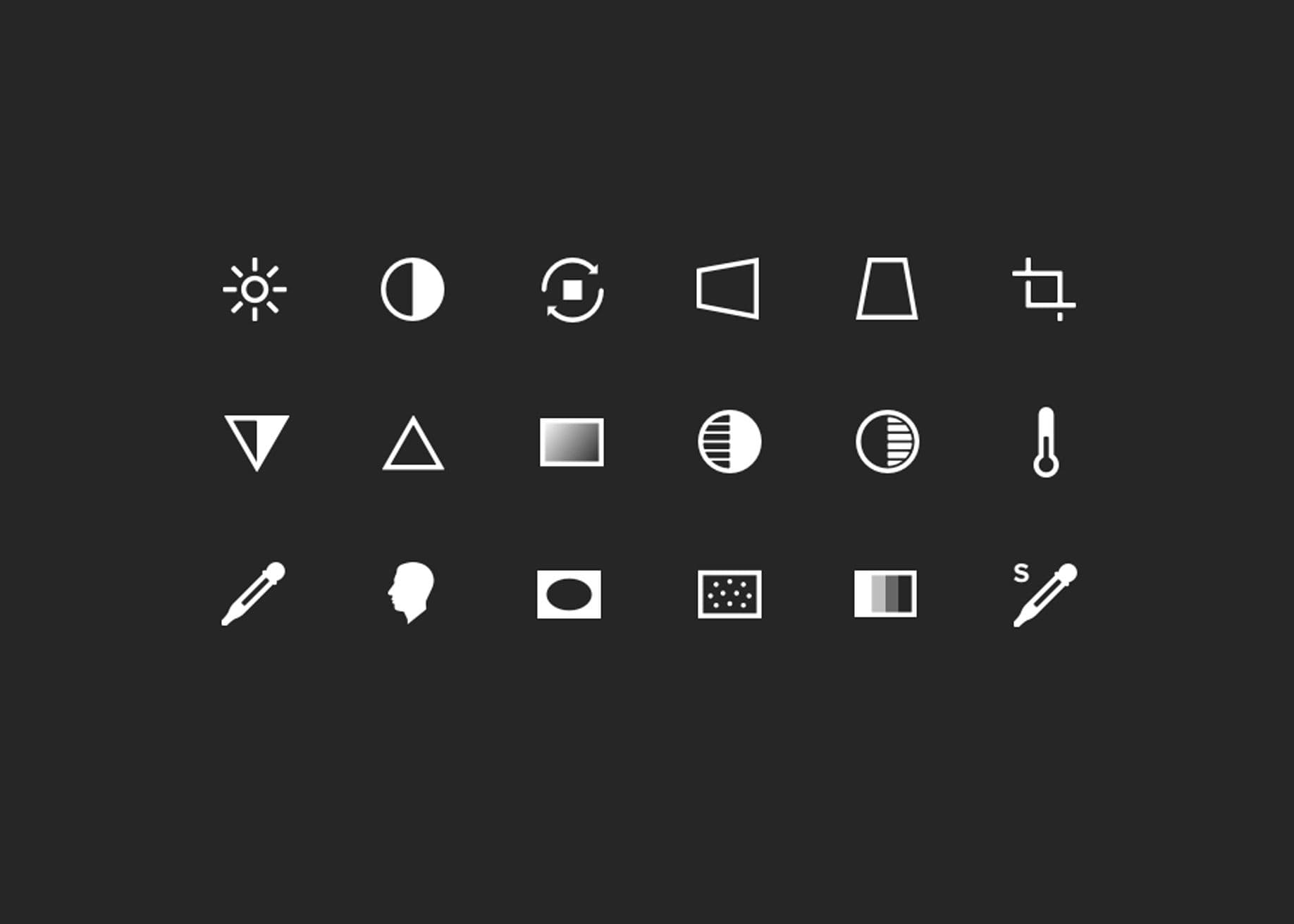
I'm an avid photographer and Instagram user, and I edit my photos using only my iPhone and Instagram. I recently revisited the VSCO app after years, which led me to conduct a self-usability test. Adding and editing photos was not fully intuitive, and I noticed the adjustment icons lacked labels. Comparing VSCO with other photo apps, I concluded that while icons can simplify UI, labels can enhance usability. Sometimes, too much simplicity can make things more complicated.
This post by Joanne was originally posted on her personal blog.
For those who don’t know, I take a lot of photos and am fairly active on Instagram. People always like to ask me what I use to take and edit my photos. My answer: my iPhone 6 (or whatever phone I am using at the time) and Instagram. Yes, I’m a purist. I used to dabble in all the other photo apps, including VSCO Cam, Snapseed, Priime, Darkroom, etc. However, with the plethora of apps, I decided to cut them all. I stuck with one (Instagram) to 1) lessen my options (paradox of choice!); and 2) challenge myself to restrict myself to one tool without all that extra fluff.
Recently, a friend of mine asked me, “Have you touched VSCO lately?” Nope. I haven’t. I haven’t touched it since 2014 and I actually don’t have it on my iPhone anymore. So I decided to download it again, and we started to play a game called “Try-to-edit-a-photo-and-guess-what-each-icon-does” a.k.a. “Jo’s self-usability test on VSCO Cam.” Let me premise with the fact that 1) I’m a UX designer; 2) I play with a lot of apps; and 3) I used to use VSCO Cam back in the day; and 4) This is my quick heuristic analysis on the app.

Adding a photo.
Should be simple, right? I landed into my “page” (apparently called Grid) and saw the last few photos that I had uploaded into VSCO in 2014. I immediately select the + icon on the left hand side, a menu slides down to show me the Grid, Journal, and Collection (words that I’m kind of familiar with, but not really). I guessed that I would add a photo to my Grid or something, so I selected that, and then, “R’uh r’oh. No photos?” Peculiar. Okay. Fine. Let’s try something else.

So I went back to the main menu, went into Library instead, and found the “Import” option. However, there are three icons on the top and me-being-me – a curious cat — I select the third icon on the right (which I still have no idea what it does and what its real functionality is). It tells me to head to the Explore page, which I don’t want todo – I just want to add a damn photo. So I select the left square icon, which I thought was going to be bring me back to the previous screen. Nope. It gives me a menu for that page. Welp, that’s different.
Instead, I had to re-select that funny square with the line through it, to get back to the previous page to import a photo. Not fully intuitive to me. I go back to the Library page, select “Import”, select the images that I want to import, and ta-da! Imported. Bam. Boom. Done. However, that definitely took longer than expected.
Editing the photo.
Editing the photo wasn’t that difficult for me, considering that: 1. I used to use this app to edit photos, so it was kind of like riding a bike again (although many EchoUsers will tell you the story of me almost killing myself at one of our client sites whilst riding a bike); and 2. I use Instagram quite often, so the icons in the toolkit were fairly familiar to me. However, I realized something that was pretty interesting — there were no labels associated with each of the adjustment icons. The user would have to select each icon to see what the functionality is. I then downloaded the other apps to see how they displayed this information.

Figure. VSCO Cam

Figure. Instagram

Figure. Snapseed

Figure. Priime

Figure. Darkroom

Figure. PS Express
Most of these apps provided labels with their icons.
Do icons enhance usability?
There’s a great article from UXMyths on the myth that icons enhance usability. Although icons are useful to simplify the UI, sometimes a label can enhance the usability a lot. There’s a great example from Microsoft. With Outlook 98, not many users had used the toolbar except for delete functionality. They conducted a variety of studies to change everything around: rearrangement of icons, positioning icons under the menus from which the commands came from, etc. In the end, they labeled the important buttons and usability of the toolbar was increased in Outlook 2003. Icons are more powerful with labels.
I’m not saying that we should add a label to every single icon. Universally understood icons can probably omit their labels, because we already know what most of it means (e.g. play, rewind, fast-forward, print, close, delete, tweet, Facebook, etc.). However, there have been times when I just want to cancel or dismiss something with the X icon, and it just ends up trashing the entire item! [insert sad Jo face here] (Like honestly, tell me Google Inbox, without a label to this, I would have probably thought that it’s some kid trying to cut off circulation in their finger to make it

Don’t get me wrong. VSCO Cam has a really sleek design with some great, simple, clean UI. However, sometimes, simplicity can actually become more complicated.
