I'm baffled by two identical 'Floor 2' buttons in my work elevator, causing daily friction. As a fan of simplicity, I value designs that emphasize essentials and sync with user mindset. Designers must strive for ease and minimal friction in key tasks. Mysteries abound.
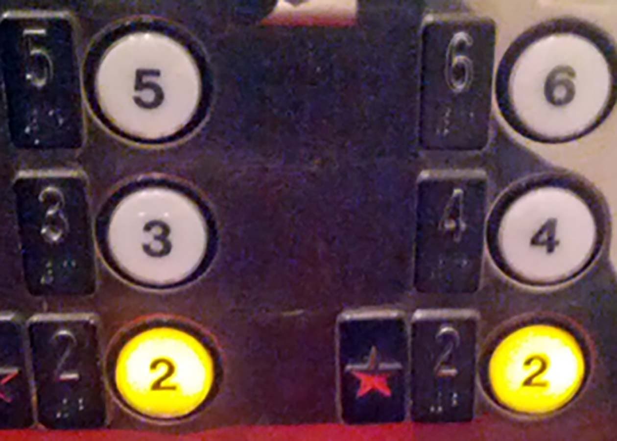
Every morning when I hop into the elevator at work, I’m greeted by this little mystery:

There are two identical ‘Floor 2’ buttons. I was bothered by this the first time I saw it and took a moment to consider which button was “right.” Turns out they do the same thing. I still often catch myself trying to make sense of it. It’s clear that the second button is redundant, but is it really such a terrible thing? Maybe it’s more convenient to reach one of them in a crowded elevator. I also imagine it must have been easier on the engineer to manufacture a symmetrical grid of buttons rather than leave one out. It’s no excuse, but it’s an explanation nonetheless. By the time I hop off the elevator, though, I always think: I just wasted the entire ride thinking about this button. That’s when it’s clear what the issue is: that little button created unnecessary friction in my day. Moments like these can quickly add up, which is why I’ve come to really appreciate simple user experiences. The best products are so simple that they don’t require a thought beyond the task at hand. How does one design for simplicity? Making a simple product doesn’t mean paring it down to a sterile, bare minimum. It means thoughtfully highlighting the most meaningful elements and organizing them in a way that aligns best with the user’s mental model. All other elements can be hidden and progressively disclosed — or removed altogether. What I like about this definition is that even the most feature-rich products can be made simple; there’s no excuse not to aim for it. What’s important is that each element should enhance the user’s ability to get something done more than it detracts from it. Doing so reduces the friction to accomplishing key tasks — to getting to Floor 2 rather than thinking about the two buttons that can get you there. Designers owe it to their users to simplify. If I could, I would rip out that second button and save us all from a few more wasted seconds in our day.
