Attended an insightful talk by Luke Wroblewski on mobile design. He shared 3 key principles: 1. One-Handed Use: Design for single-thumb interactions. 2. Focused Flows: Streamline tasks & minimize screen transitions. 3. "Just In Time" Actions: Introduce features contextually. Emphasizing the importance of mobile design. 📱
Cowritten by: Carol Chen and Kenny Iyoya
--
Introduction
Several of us at EchoUser attended last Thursday’s Designers + Geeks event, where designer, strategist, and Mobile First author Luke Wroblewski delivered an insightful and hilarious presentation on designing for content creation and consumption on mobile devices. In his trademark, Luke (@lukew) started off by packing his slides with persuasive charts demonstrating the importance of designing well for mobile creation. Some food for thought:
Many of the top sites in the US in terms of time spent per user (Facebook, Yahoo, AOL, Google, and YouTube) derive their value from user-generated content. What is Facebook without wall posts, YouTube without videos?
The only form of media consumption that is growing in the United States is mobile (primarily phones and tablets). In numbers, worldwide YouTube users upload three hours of footage every second from their mobile apps; 10,000 cars are sold every week through eBay on mobile (crazy!)

- Although many still claim mobile devices are primarily used for entertainment (e.g. cat videos), mobile is becoming the main outlet for people to perform a wide array of utilities, from shopping, to managing finances and health, to preparing events and planning travel.
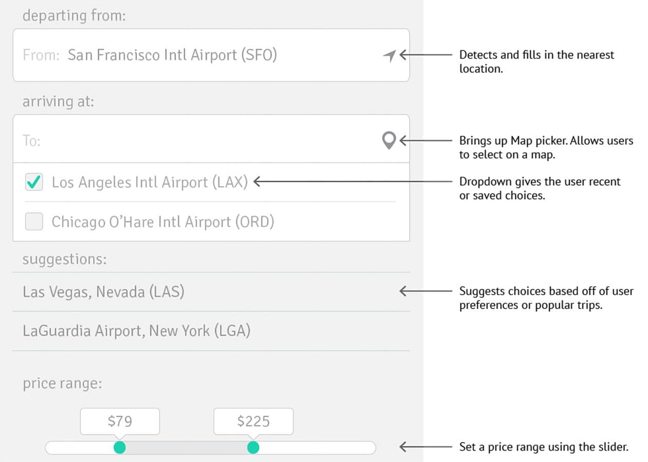
Ergo, it’s imperative to design simple and fast interactions for creating mobile content. With a captive audience, Luke launched into the meat of his presentation: Three patterns for how to design exceptionally well for mobile creation: One-Handed Use Since 75% of mobile users interact with their devices using only one thumb, the design of interfaces should take one-handed use into consideration. In one-handed use, gestures such as tapping or swiping are significantly easier than typing. If we can prevent the keyboard from popping up until absolutely necessary, we can optimize the users’ experience and ensure that they use our products again.

According to Luke, there are many means to optimize flows and bypass the use of the keyboard. Utilizing smart defaults (such as the “how to” text in the above figure), algorithmic autofilled text, suggestions, easily navigable map and date selectors, and sliders can help people use their programs with only one finger.

Focused Flows
Often, flows are convoluted with a range of inputs across numerous screens. To increase mobile usability, designers must make it quick and easy to complete each task, eliminating any unnecessary back and forth between screens.
Follow Hotel Tonight’s footsteps: They made it so easy to book hotels that cats were doing it. In contrast with the more traditional, laborious flow employed by Hotels.com, Hotel Tonight’s approach is: Here are some hotels; pick one. Their flow is extremely focused, with only three screens from the list of hotels in a city to hotel information and booking to a verification page. They even came up with a clever solution for ensuring that humans were booking hotels by requiring users to trace their logo to complete the booking.

Creating a focused flow isn’t easy. It takes big changes to go small. But improved flows make it easier for users to read, write, and interact with their content. Remember the words of Tim Cook: “Creativity is people who care enough to keep thinking about something until they find the simplest way to do it.”
“Just In Time” Actions
Luke’s third method to improve mobile use is through providing users with “just in time” education and actions. Instead of using extensive first-time education tutorials to demonstrate the use of an app, it is more effective to introduce new skills when they are relevant (hence, “just in time” education).
Since space is at a premium on mobile phones, a similar logic of “just in time” actions can be used to simplify interfaces. For example, when users scroll down in their Google+ feed, the header and footer menus slide out of view, allowing the feed to take up the entirety of the screen. When users pause or scroll back up, the menus come back to view.
—
As mobile is rapidly becoming the primary means through which users interact with the web, it’s important to design to enhance and simplify the user experience. Through designing for one-handed use, creating focused flows, and employing “just in time” actions, we can create sites that allow people to simply and seamlessly read and write from their mobile devices.
