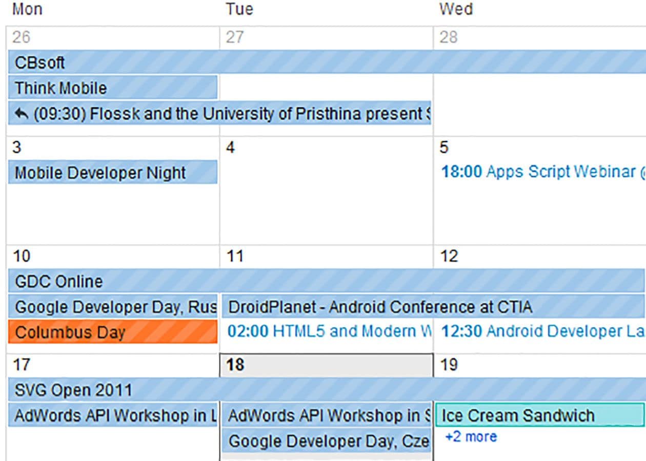
We examine the baffling design elements in the updated Google Calendar interface, discovering the rationale for striped events and stressing unambiguous design cues.
One of the most frustrating things for me as a consumer is when I can’t figure out what a particular design choice is supposed to mean. When I can tell the decision wasn’t arbitrary, but I can’t figure out its logic, it sends me into a tailspin. I must be able to figure out the rationale, and I will dig until I do! Recently, Google launched a new interface for its calendar service. While the functionality remained mostly the same as the previous version, the makeover came with a new color palette (RIP custom colors). And suddenly, some of my events had stripes, while others did not.
Noah and I were determined to get to the bottom of this. Events we did not create were striped, but events we created were not? That seemed to be true, but it didn’t explain every case. Were the stripes on events we’d been invited to but hadn’t accepted yet? Nope. Events on other people’s calendars? Not necessarily. Finally, I gave up on sussing out the logic myself and turned — where else? — to Google. There, I finally found my answer: Events I could not edit were striped, and events I could edit were not. Granted, my confusion didn’t fundamentally change my ability to use my calendar; I could still tell where I was supposed to be and when. But I still think there’s a lesson there: If your design signals that two things are different from each other, it’s a good idea to be absolutely clear about what the difference is, lest you cause unnecessary angst.
