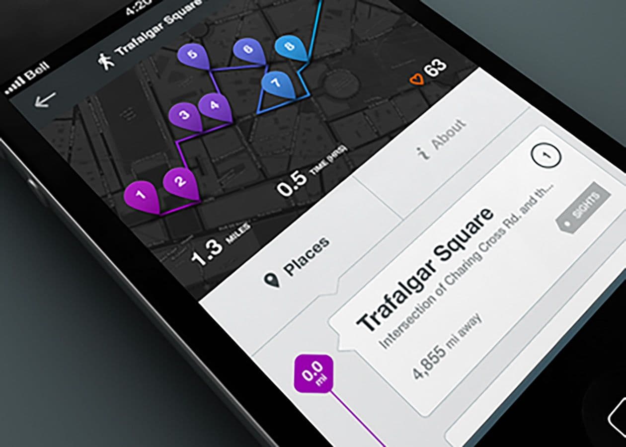
To enhance your designs and workflow, adopt a suitable color palette and grid pattern early on, ensuring consistency. Prioritize whitespace and integrate visual design principles with interaction design layouts. Develop a guide from the start for a smoother project progression.
Whether you’re a grandmaster or a grasshopper, remembering these tips will help the quality of your designs and the efficiency of your workflow. Some are pretty fundamental and seem like common sense, but those are the ones that can sneak up and surprise even the veterans if they’re not careful.
Establish a color palette early. Stick to it.
Among many things, a quality UI color palette: Works regardless of color blindness. The trick here is having variation in the values of your palette, not just the hues. Works well despite significant contrast differences (not everyone is using a cinema display in a dim room).
Establish a grid pattern early. Stick to it.
Some people don’t like the idea of grids because they feel that they constrain their work. This may be true in certain ways, but it’s more important to have a consistent and usable UI than to have the artistic freedom of fine art. Just remember to keep them consistent throughout workflows within the UI. Every page doesn’t have to be the same. There are many different types to play with: manuscript, column, modular, radial, etc. The end result should always be usable, consistent, learnable, and scalable.
There’s almost always room for more whitespace.
When in doubt, provide more. It’s easier to take away then to get it back. .
Visual design principles should inform the interaction design layout from the beginning.
This is much more efficient and results in a more appealing and consistent design. When visual design is brought in after interaction design is already in full swing or finished to “skin” the IxD it’s a recipe for a lot of unnecessary stress and work. If the only thing a visual designer is doing is “skinning” wireframes, he or she is either doing a crap job, or being forced into a scenario in which their only option is a crap job. Neither are fun and both result in crap work.
Start building a guide from the beginning.
Add to it as the project progresses rather than putting it together at the end of the project. This will do at least two things: 1. It will help to establish and cross check the color palette, grid, fonts, and spacing scheme for mistakes and inconsistencies, and 2. It will reduce the stress that is unavoidable at the end of a project as all the deliverables need to come together.
Hopefully these tips help out. If you have any questions feel free to follow and ask EchoUser on Twitter.
