As a 501(c)(3) nonprofit, Gooru’s mission is to honor and preserve the human right to education. To achieve their goal of making educational tools more accessible, Gooru is building a free personalized learning solution that helps teachers find, remix, and share collections of web resources for any K-12 curriculum. The nonprofit had the knowledge, relationships, and experience to drive this endeavor, but sought a partner to focus on bringing top-notch user experiences to both students and teachers. Initially, EchoUser helped design pieces of the experience; eventually, the team decided to overhaul all of Gooru’s offerings from the ground up, with the challenge of making the experience resonate for two very different users: teachers and students.
Approach
The EchoUser UX as a Service model allows us to be flexible, allocating time and resources to different areas of focus as priorities shift and opportunities for development arise. We began our engagement with a Discovery Month to immerse our team in the vision, product, and context necessary to distinguish the experience Gooru wanted to create. This helped us map out the ongoing UX work over the coming months and plan ahead.

In early research stages, we facilitated a discovery workshop to determine what key emotional drivers — or “Guiding Principles” — lay behind all things Gooru. Identifying these key pieces would help anchor future designs to consistent holistic experiences. We conducted a short design sprint to further comprehend how the Gooru development process works and determine how best to incorporate a UX process.
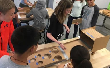
We identified key UX priorities with adjustable timelines over the subsequent months, but our UXaaS model allowed for ad hoc changes in UX support as needed. In one example, we had focused on designing features for the Back to School release in September 2014, which paved the way for more opportunities to interact with teachers and educators. We took the opportunity to conduct a Design Jam workshop with teachers, educators, Gooru team members, and EchoUser designers to brainstorm and design ideas for new features and concepts to further support students.

The full conceptualization of the product, supported by rounds of comprehensive research, revealed the need for an extensive redesign. Our team was faced with an overhaul of the entire experience, the first step being to deeply understand the current experience. This process kicked off with an “expert review” of the existing user interface, in which we evaluated aspects of the product that did and didn’t work. We conducted further research to understand the needs of both user groups, and developed personas to inform the design process.
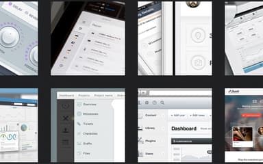
EchoUser created several low fidelity concepts for the new Gooru 3.0, and — with the help of the Gooru team — iterated upon the designs to reach a concept we felt would best support the users. Once a direction was established, the EchoUser team procured higher fidelity wireframes, and extensive user testing began to validate the refined concepts.
Impact
EchoUser set the stage for Gooru to release a new version of their product each year. EchoUser continued after this foundational project on wire-framing, user testing, and additional visual design advancements.


